Q.U.B.E.
New gameplay footage for Q.U.B.E. 2 is out there for us to look at and see what has changed since Q.U.B.E. in many different ways
There have been a whole lot of demos out there in the wild for Q.U.B.E. 2 and if you have not been lucky enough to get out to any of the recent big conventions, then you have been left out in the lurch. That is of course if you have not been stalking Toxic Games online and catching anything and everything that they have been laying down for the game. If you do not have the time for all of that though, then rest assured that we do and that is what we have here for you as we were able to get a good chunk of gameplay for Q.U.B.E. 2 just for you to see. No fooling around this time so you best pass it along so that everyone can have a chance to take a look at just where the game has evolved to at this point.
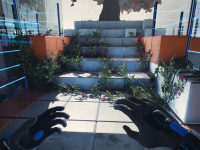
What you are about to see here for Q.U.B.E. 2 is some early footage of what looks like a "tutorial" portion of the game. I say this as we are slowly introduced again to the different colored cubes in the game world and just how they can be manipulated and used to get from place to place. We get to see the blue ones that act as a trampoline of sorts, red ones that can be pulled out and in to make steps or walls as needed, and then the green that can be removed from their location using the various other colors all to help you get around the levels. If Q.U.B.E. 2 is anything like the original then there are other colors in the mix too but we just do not get to see them in action as of yet. Maybe at some other time.
Q.U.B.E. 2 — Demo Gameplay - First Look
The work in progress footage shows off an early section of the game, introducing the player to the functions of each colored cube. In Q.U.B.E. 2, as opposed to the prequel, the player now has the power to decide which colored cubes are placed into the sequel’s beautifully realized and varied environments.
I am quite surprised at how great Q.U.B.E. 2 looks when compared to the previous title that was released not too long ago. It definitely looks like Toxic Games learned a few new lessons and tricks from the "remaster" and applied it here as the game's world looks amazing here; even with it only being the small section we do get to see. Granted, it is not hard to make solid cubes and basic lights look good in general, but given that there is so much more to Q.U.B.E. 2 it has to be taken into account for the little things that we gamers usually ignore when actually playing. All of this is the greatest of compliments to the team.
What are you thinking about Q.U.B.E. 2 now that we have had a bit more of the gameplay to look at and enjoy here? Do you agree that it looks even better than before and can only go up from here or are you in the camp of it being basic enough to be easy to do? What other colors do you think we will get to play with from the previous title or just to make this on have some extra new stuff? Let us all know down in the comments and then discuss. For more on Q.U.B.E. 2, keep checking in on the site here as we will have all of it as we head on toward its 2018 release schedule.









![Mouse: P.I. For Hire — Hades Plays The Game [PS5 Gameplay] Mouse: P.I. For Hire — Hades Plays The Game [PS5 Gameplay]](https://img.youtube.com/vi/kjaVMT7SwOY/default.jpg)


