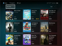
Doesn't it really look like it is set up more to sell ad space than anything? Even the search bar looks more convoluted than it needs to be. Why can't we just have it broken down into just sections where the most recent items are listed and you can scroll down to see older items? It doesn't allow for Sony to push what content they think we should think is most important, that's why. Or at least what I think the reason is.
I do admit that being able to have all the linked content of a franchise in one location is cool, but nothing overly useful for myself as far as how films and anime go. I guess the bonus will be that you won't have to switch stores to get the video content from the PSN. I guess that is the real bonus there. What do you all think? Yes it does look like other store fronts out there, but why not use what has been proven to work.









![Invincible VS — The Art Of GORE [BTS] Invincible VS — The Art Of GORE [BTS]](https://img.youtube.com/vi/cs9BGxVMrG8/default.jpg)


